If your LinkedIn posts get under 1% engagement, they’re likely missing the mark. If they land in the 2% to 5% range, you’re in a solid zone. And if they hit 5%+, the post is doing more than average.
I’d judge founder content on engagement rate, post format, follower count, and buyer response - not likes alone. For most B2B founders, personal profiles perform better than company pages, with 3.85% average engagement vs. 2.1% for brand pages. And smaller founder accounts often post higher engagement rates than larger ones.
Here’s the short version:
- Use this formula: (Clicks + Likes + Comments + Shares + Follows) ÷ Impressions × 100
- Use these ranges:
- < 1% = weak
- 1%–2% = normal
- 2%–5% = strong
- 5%–10% = top tier
- 10%+ = rare spike
- Judge each format on its own: carousels, images, video, text, polls, and link posts do not perform the same
- Watch comments, profile views, and DMs: those often matter more than raw reactions
- Track results over 30 or 90 days: one big post can skew your average
A few numbers stand out fast:
| Format | Typical Engagement Rate | What I’d keep in mind |
|---|---|---|
| Document / PDF Carousel | 6.60%–7.00% | Often the strongest format |
| Multi-Image | 6.45%–6.80% | Good for story-based posts |
| Video | 5.90%–6.00% | Strong rate, but reach can be lower |
| Standard Image | 5.20%–5.30% | Steady baseline |
| Text-Only | 2.90%–4.50% | Big swing based on the first line |
| Poll | 3.80%–4.20% | High views, lighter intent |
| External Link | 3.25%–3.70% | Often gets less reach |
Bottom line: I wouldn’t ask, “Did this post get likes?” I’d ask, “Did the right buyers comment, view my profile, or send a DM?” That’s the lens that makes these benchmarks useful.
Current LinkedIn Engagement Benchmarks for B2B Founders
Overall Engagement-Rate Ranges to Use as a Baseline
For active B2B founders, 2%–5% is a practical starting range. That said, the number can move quite a bit based on your audience size, niche, and the quality of your network.
Use the table below to compare these ranges with your own profile.
One thing trips people up all the time: engagement tends to shrink as follower counts grow. Founders with 500 to 2,000 followers often see engagement rates in the 4% to 8% range, while accounts with 50,000+ followers average closer to 1.8%. So if a larger account posts a lower percentage, that doesn't automatically mean something is off. As the audience gets bigger, engagement rates usually tighten.
Median vs. Average Engagement and Why Both Matter
Your average engagement rate counts every post, including the occasional post that takes off. That can skew the picture and make your week-to-week baseline look better than it is.
The median (P50) gives you a steadier benchmark because it shows what a normal post tends to do.
Use engagement to judge business intent, not just post popularity.
A simple way to think about it: use the median to set day-to-day expectations, and use the average to spot whether your content shifts are changing results over time.
Benchmark Table by Performance Tier
Use the table below as your working baseline.
| Performance Tier | Engagement Rate | How to Read It |
|---|---|---|
| Below Benchmark | < 1% | Underperforming; too promotional or generic. |
| Typical / Median | 1%–2% | Average for most founder-led profiles. |
| Strong / Good | 2%–5% | Healthy zone for founders building a personal brand. |
| Top Range | 5%–10% | Strong; signals high resonance and sharing. |
| Exceptional | 10%+ | Exceptional; usually limited to viral or niche expert posts. |
These baselines change by post type, which the next section breaks down.
sbb-itb-f8f3793
How Do I Calculate LinkedIn Engagement Rate? - Social Media Business Playbook
Engagement Benchmarks by Post Format
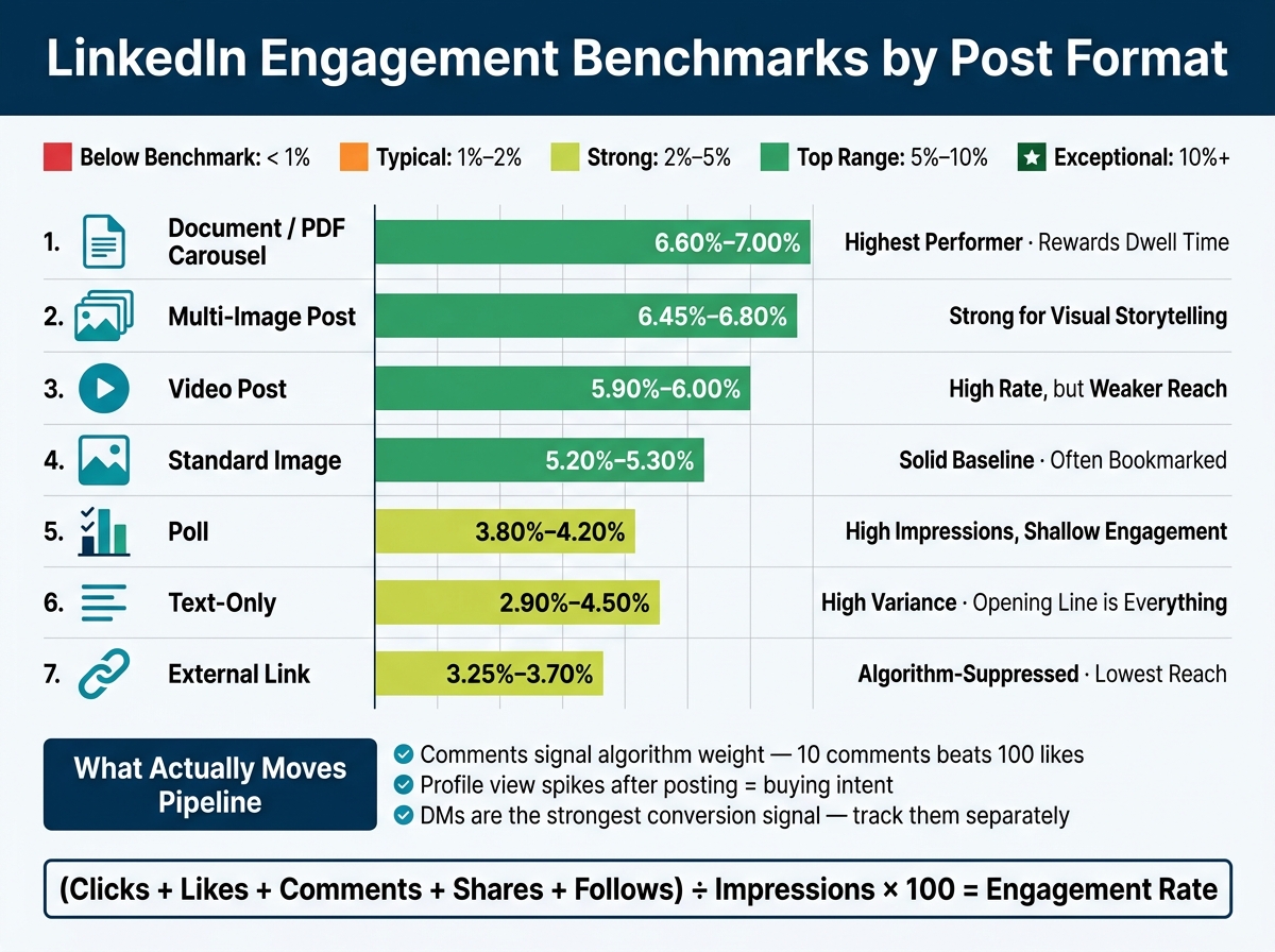
LinkedIn Engagement Benchmarks by Post Format for B2B Founders
How Text, Document, Carousel, Image, Video, and Link Posts Compare
Use format-based baselines before you judge how a post did. On LinkedIn, not every post type starts from the same place. Some formats simply get more help from the platform, especially when they keep people on LinkedIn longer, a key focus for those comparing LinkedIn growth tools to drive intent-led engagement.
Document / PDF Carousel posts sit at the top, with average engagement of 6.60%–7.00%. That makes sense. People swipe through slides, spend more time with the post, and send stronger dwell-time signals. More time on post often means more distribution.
Link posts come in much lower at 3.25%–3.70% because LinkedIn tends to limit reach for posts that push users off-platform.
Video posts average 5.90%–6.00%, which looks strong on paper, but there’s a catch: reach is weaker than that rate suggests.
Text-only posts have the biggest swing of any format, ranging from 2.90% to 4.50%. That’s the tricky part. A sharp first line can push a text post near the top. A flat opener can bury it fast. More than any other format, text lives or dies on execution.
Benchmark Table by Format
| Post Format | Avg. Engagement Rate | Relative to Text | Performance Note |
|---|---|---|---|
| Document / PDF Carousel | 6.60%–7.00% | 3.2x | Highest performer; rewards dwell time |
| Multi-Image Post | 6.45%–6.80% | 1.7x | Strong for visual storytelling and likes |
| Video Post | 5.90%–6.00% | 2.1x | High rate, but reach is weaker than it appears |
| Standard Image | 5.20%–5.30% | 1.7x | Solid baseline; often saved/bookmarked |
| Text-Only | 2.90%–4.50% | 1.0x (baseline) | High variance; the opening line drives results |
| Poll | 3.80%–4.20% | 0.9x | High impressions, shallow engagement |
| External Link | 3.25%–3.70% | 0.6x | Lowest reach potential; algorithm-suppressed |
Format explains some of the spread, but not all of it. The next piece is knowing how to read these numbers the right way.
How to Read the Benchmarks Correctly
What Weak, Normal, and Strong Performance Look Like for Founder-Led Content
Use these ranges as context, not as a scorecard. A strong post isn't just a post that gets reactions. It's a post that pulls in the right people.
Follower count still plays a part. Smaller accounts often see higher engagement rates than larger ones. But audience fit matters more than raw volume.
Once you adjust for audience size, the next thing to check is who is engaging. For founders, the real benchmark is whether the right buyers respond, not whether the post simply looks popular.
Why Comments, Profile Views, and DMs Can Matter More Than Raw Reactions
This is why raw reaction counts almost never tell the whole story. Likes are the weakest signal you can act on. LinkedIn's algorithm gives more weight to comments than likes, so a post with 10 comments and 20 likes will often beat one with 100 likes and only 2 comments. For founders, though, the bigger point is what comments can lead to.
A buyer comment is a pipeline signal. A spike in profile views after a post goes live can show you who's taking a closer look. And a DM is often the clearest signal of all.
These follow-on signals won't show up in your engagement rate. But they're the ones that can help move deals forward. Track comments, profile views, and DMs together so you can spot buying intent sooner.
How to Track Your Own Benchmarks Over Time
Use a Consistent 30-Day or 90-Day Tracking Window
Once you know what good performance looks like, measure it the same way every month. Stick with the same 30-day or 90-day window each time you check results, so one breakout post doesn't skew the trend.
Pull your numbers from LinkedIn Analytics > Posts, use one date range, and compare total engagements against total impressions.
Also, track each format on its own. Benchmarks change by format, so a text post shouldn't be judged the same way as a carousel or video. Once your date window stays fixed, you can read the numbers with more confidence and judge each format by its purpose.
Key Takeaways for B2B Founders Reviewing LinkedIn Performance
Use these benchmarks to see whether your content is driving buyer-level engagement, not just surface-level activity. The main goal is simple: compare each post type against its own baseline.
A few things matter most:
- Format changes performance. Carousels and native media tend to beat plain text posts. External links still cut reach, so it's usually better to place the link in the first comment.
- Comments and DMs matter more than raw engagement rate. What moves pipeline is comment quality, especially when comments lead to DMs from target buyers.
Engagement only means something when it lines up with buying intent.
FAQs
How many posts should I track before judging my benchmark?
Don’t judge your benchmark from a tiny sample like your last five posts. That can give you a warped picture fast.
Instead, look at performance over 30 to 90 days. That gives you a steadier read on how your content is doing.
Use your LinkedIn Analytics dashboard to work out a stable engagement rate. Divide total engagements by total impressions.
That simple step helps smooth out day-to-day swings.
Should I compare my engagement rate by post format or overall?
Use both.
Your overall engagement rate gives you a quick read on your account’s general health and visibility against broad benchmarks.
At the same time, engagement can swing a lot by format. A Reel, a carousel, and a single-image post often perform very differently. That’s why it helps to compare results by post format too.
Use overall rates for high-level tracking, and format-specific benchmarks to see which content is actually connecting with people.
What signals matter most if I want LinkedIn to drive pipeline?
Focus on high-intent engagement, not vanity metrics like impressions. The clearest signal is comment quality. When people leave thoughtful, multi-sentence comments, that usually means your post hit a nerve in a way a simple like never can.
It also helps to watch dwell time. If your post earns a See More click or keeps people reading longer, that’s a strong hint the content is doing its job.
Postelix helps you spot high-value comment opportunities and draft replies in your voice, so engagement can turn into qualified inbound conversations.