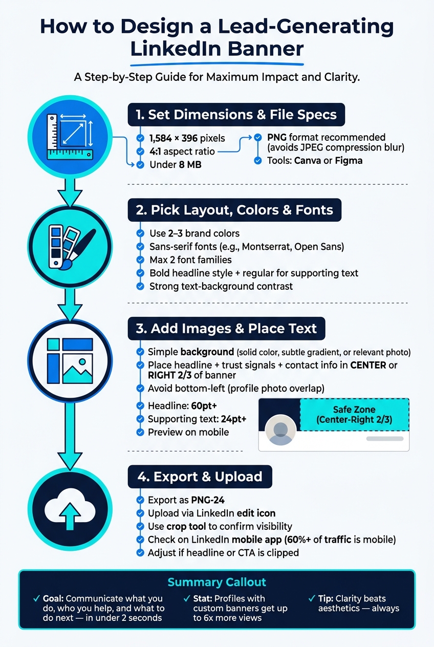
Your LinkedIn banner isn’t just decoration - it’s a tool to grab attention and generate leads. A well-designed banner should clearly communicate what you do, who you help, and what action to take next within 2 seconds. Profiles with custom banners get up to 6x more views, and with 60% of LinkedIn traffic on mobile, your banner must work across all devices.
Key Takeaways:
- Set a goal: Decide if you want to drive connections, calls, downloads, or recognition.
- Know your audience: Target specific roles, industries, and challenges.
- Craft a message: Use a clear value proposition like "I help [Audience] achieve [Outcome]."
- Design for LinkedIn: Use dimensions of 1,584 × 396 pixels, avoid clutter, and keep critical elements in the center or right side to avoid profile photo overlap.
- Test and update: Use LinkedIn analytics to track performance and tweak your banner every 6–12 months.
Your banner is free profile real estate - use it wisely to turn visits into business opportunities.
Define Your Lead Goals and Banner Message
Set Clear Lead Generation Goals
Before diving into design, it’s crucial to define what you want your banner to achieve. A banner without a clear purpose is just decoration. The goal should guide every decision you make.
What action do you want visitors to take? Maybe it’s sending a connection request, scheduling a discovery call, downloading a resource, or simply recognizing your expertise and reaching out. These actions are the first steps in LinkedIn lead generation for founders looking to build a consistent pipeline. Each of these outcomes demands a slightly different approach. Your banner’s job is to reinforce your headline, as Keith Teo, Founder of Cclarity, explains:
"Your banner should reinforce the same message as your headline. If your headline says 'Helping B2B SaaS founders build predictable pipeline,' your banner should NOT be a sunset over the ocean."
Once you’ve locked in your goal, you can focus on tailoring your message to resonate with the right audience.
Identify Your Target Audience and Their Problems
The most effective banners speak directly to a specific type of person rather than trying to appeal to everyone. Start by defining your ideal client. Be as precise as possible: consider their role, industry, and company size. For example, you might target "mid-market CFOs in financial services" or "B2B SaaS founders at Series A startups." This level of detail ensures your banner attracts the right people while naturally filtering out those who aren’t a match.
Next, identify the main challenge your audience faces. Your banner should address this directly. For instance, it might highlight solutions like "cutting indirect spend by 20–40%" or "building a predictable pipeline." Vivek Makadiya, a LinkedIn Banner Design Specialist, emphasizes the importance of clarity:
"High-quality clients are not usually impressed by noise. They are impressed by clarity. They want to know who you help, what you do, and whether you look like someone who understands positioning."
Specificity signals confidence, while vague language can make you seem unsure. With a clear understanding of your audience and their pain points, you can craft a message that resonates.
Write a Simple Value Proposition for Your Banner
You have about two seconds to grab attention and communicate your value. A concise, clear value proposition is key. Use one of these formulas to create a one-sentence message:
| Formula | Example |
|---|---|
| Direct Value | "I help [Audience] achieve [Outcome]" |
| Problem/Solution | "Struggling with X? I help Y achieve Z" |
| Transformation | "From [Current State] to [Desired State]" |
| Positioning | "The [Role] for [Niche]" |
Choose one formula and ensure your message passes the "stranger test" - a stranger should understand your value within two seconds. As Keith Teo wisely puts it:
"Clarity beats aesthetics. A plain white text on a dark navy background that says what you do will ALWAYS outperform a beautifully designed graphic that says nothing."
sbb-itb-f8f3793
How to Create a Linkedin Banner that Attracts Clients (step-by-step canva tutorial)
Plan Your Banner Content and Layout
Once you've nailed down your value proposition and identified your target audience, the next step is figuring out how to visually convey your message effectively.
Include the Right Banner Elements
A great banner doesn’t need to be complicated - just complete. To make it work, focus on these four key elements: your value proposition, your niche, authority signals, and contact details.
Your niche helps clarify exactly who your message is meant for. Authority signals - like client logos, certifications, or specific results (e.g., "200+ meetings booked") - instantly build trust. Finally, include straightforward contact details to encourage action.
Once you’ve got these pieces, the challenge is adapting them to fit LinkedIn’s layout.
Work Within LinkedIn's Layout Constraints
Designing for LinkedIn comes with its own quirks. One major factor? Your profile photo. It sits in the bottom-left corner of your banner, covering a significant portion of that space. On mobile, the photo shifts even closer to the center, hiding even more of your design.
To avoid this, keep the center and right two-thirds of your banner reserved for your main content. Always preview your design on mobile to make sure nothing important gets cropped. Vivek Makadiya, a LinkedIn Banner Design Specialist at The Divine Tech, sums it up perfectly:
"A beautiful banner that hides your message behind your profile photo is basically a nice suit with the price tag still attached."
Keep Your Design Simple and Easy to Read
One of the biggest mistakes people make with banners is overloading them with information. Vivek Makadiya offers this insight:
"Clutter signals a lack of focus. It says, 'Please notice all twelve of my services.' Confidence says, 'I know exactly what I want to be known for.'"
Stick to 1–2 lines of text, max. Use a bold, easy-to-read font - your main headline should be in the 60–80pt range, while any supporting text can be 24–36pt. Leave 20–30% of the banner as empty space to give your design breathing room. This simplicity makes it easier for viewers to absorb your message at a glance.
Lastly, make sure your text contrasts sharply with the background - dark text on a light background or vice versa works best. The goal? Someone should understand exactly what you do within two seconds of landing on your profile.
How to Design a LinkedIn Banner: Step by Step
How to Design a LinkedIn Banner That Generates Leads: Step-by-Step
Once you've nailed down your lead goals and banner message using tools for intent-led LinkedIn growth, it's time to design a banner that grabs attention and drives results. Here's how to do it, step by step.
Set the Right Dimensions and File Specs
Start by setting your banner dimensions to 1,584 × 396 pixels with a 4:1 aspect ratio. Keep the file size under 8 MB. LinkedIn supports PNG, JPG, and GIF formats, but PNG is your best bet. Why? LinkedIn compresses JPEGs heavily, which can blur your text and logos.
Tools like Canva and Figma can make this process easier. Canva even offers a pre-built template with the correct dimensions, so you can skip manual adjustments. If you prefer more control over typography and layout, Figma is a solid choice.
Pick a Layout, Color Palette, and Fonts
Stick to 2–3 colors that align with your brand. A consistent color scheme helps people recognize your brand faster.
When it comes to fonts, go for clean sans-serif options like Montserrat or Open Sans. These fonts are easy to read across different screen sizes. Use no more than two font families, and create a clear hierarchy by applying bold styles to headlines and regular styles to supporting text. Keith Teo, Founder of Cclarity, emphasizes:
"The goal is clarity, not beauty. A plain white text on a dark navy background that says what you do will ALWAYS outperform a beautifully designed graphic that says nothing."
Also, make sure there’s strong contrast between your text and background. This ensures your message is readable at a glance.
Add Images and Place Your Text
Choose a simple background - think solid colors, subtle gradients, or relevant photos. Avoid busy designs that compete with your text. As Vivek Makadiya, LinkedIn Banner Design Specialist, warns:
"If the background is louder than your message, it is stealing the microphone."
Place your headline, trust signals, and contact info in the center or right two-thirds of the banner. Be mindful of LinkedIn's profile photo placement, and test your design on both desktop and mobile to ensure nothing important gets covered. For readability, set your headline size to 60pt or larger, with supporting text at least 24pt for mobile screens.
Export and Upload Your Banner to LinkedIn
Export your design as a PNG-24 file, then upload it using LinkedIn's edit icon. Use the crop tool to ensure all critical elements are visible. After uploading, check your banner on the LinkedIn mobile app. Since more than 60% of LinkedIn traffic comes from mobile devices, you'll want to make sure everything looks great there. Mobile cropping tends to be more aggressive than desktop, so if your headline or call-to-action gets clipped, adjust the design by moving key elements closer to the center-right and re-upload.
Once your banner is live, keep an eye on its performance and tweak it if necessary to maximize its effectiveness in converting profile views into meaningful leads.
Test and Update Your Banner Over Time
Use LinkedIn Analytics to Check Performance
Launching your banner is just the start. LinkedIn's analytics tools let you see if your banner is drawing the right audience to your profile.
One of the most telling insights is who's visiting your profile. LinkedIn provides details like job titles, companies, and locations of visitors. For example, if your banner is designed to attract "SaaS founders booking demos" but your profile mainly gets visits from students or job seekers, it's a clear sign your message isn't hitting the mark. That’s your cue to make adjustments.
"Regularly analyze profile performance metrics to identify areas for improvement." - Vengreso
LinkedIn keeps this demographic data available for 180 days, giving you plenty of time to identify trends. Use these insights to guide any necessary tweaks to your banner.
Update Your Banner to Match Current Campaigns
Your banner should always align with your latest campaigns. If your analytics show a mismatch or your promotions have changed, update your banner to reflect your current focus.
"Your LinkedIn banner is not decoration. It is prime real estate for converting profile visits into clicks, clicks into landing page traffic, and traffic into launch momentum." - Kickstarts.info
For example, if you're promoting a webinar, lead magnet, or product launch, ensure your banner reinforces that message. This creates a smooth journey for visitors: they see your post, click your profile, and find a banner that supports the same campaign. A consistent message builds trust and keeps visitors engaged.
During a campaign, you may need to update your banner multiple times. For instance, you could start with "Spots available", then switch to "Join us live", and finally to "Watch the replay." Each update keeps your banner relevant and shows you're actively engaged.
Review Your Banner Regularly
Regular reviews ensure your banner stays effective. Aim to check it every 6 to 12 months to confirm the message, design, and mobile appearance align with your current goals. Mobile optimization is especially important since many users access LinkedIn on their phones.
When reviewing, use a simple checklist: Does the message match your headline? Is the offer still relevant? Does the design look polished on mobile?
"A custom-designed banner tells recruiters, clients, and peers that you are attentive to detail, tech-savvy, and serious about your professional brand." - CloudyConvert
If you're using tools like Postelix to track leads and engagement, make sure your banner reflects the conversations and outreach you're currently focusing on. As your messaging evolves, your banner should follow suit to stay in sync with your goals.
Conclusion: Next Steps for a Lead-Focused LinkedIn Banner
Your LinkedIn banner is more than just a decorative element - it’s a powerful, always-visible tool for generating leads. Too often, it gets overlooked or filled with generic designs that don’t communicate value. A strong, focused banner grabs attention in under 2 seconds, directs visitors to take action, and reinforces the message behind your campaigns.
"Your banner is free real estate. It costs nothing to update and takes 15 minutes to create. Yet it is one of the most overlooked elements of LinkedIn profile optimisation." - Keith Teo, Founder, Cclarity
Start with a quick banner audit. Does your current design clearly state who you help or what you offer? If not, that’s the first thing to fix. Choose a single, clear message - like a value proposition, an impressive stat, or finding buyer-relevant post angles for a direct call-to-action (CTA). Keep all essential content in the center or right two-thirds of the image for maximum visibility. Before finalizing, check how it looks on mobile to ensure it’s effective across devices.
Once your banner is live, keep it relevant. Update it to reflect current campaigns, promotions, or milestones. Use your profile visitor data to confirm that the right audience is engaging with your page. Refresh your banner every six months or after hitting a major goal. If you’re leveraging tools like Postelix to track warm leads and engagement, ensure your banner aligns with the messaging in your outreach. Consistency across all touchpoints is what transforms profile views into meaningful conversations.
FAQs
What should my LinkedIn banner CTA be?
Your LinkedIn banner's call-to-action (CTA) should give viewers a clear next step that aligns with your lead generation goals. Examples like "Learn More," "Get Your Free Guide," or "Join Our Webinar" work well. Keep your CTA short, focused on action, and directly tied to your campaign's purpose to boost engagement and drive results.
How do I keep my banner readable on mobile?
To make sure your LinkedIn banner looks great on mobile devices, keep key content within the safe zones. Avoid placing important text or visuals in the bottom-left section (568×264 pixels), as this area is covered by the profile photo.
Here are a few tips to ensure readability and a polished look:
- Use high-quality images: Crisp visuals make a strong impression.
- Opt for a font size of at least 24px: This ensures your text remains clear and legible, even on smaller screens.
- Leverage design tools with safe zone overlays: These tools help you align your design effectively for both mobile and desktop views.
By following these guidelines, your banner will maintain its professional appearance across all devices.
What should I track to know my banner works?
To gauge how well your LinkedIn banner is performing, keep an eye on metrics like profile visits, connection requests, and message inquiries. After updating your banner, see if there’s a noticeable uptick in these numbers.
Make sure your banner clearly conveys your value proposition or includes a strong call to action that aligns with your lead generation objectives. Tools like LinkedIn analytics can help you track these trends and determine whether your banner is drawing in the right audience and increasing engagement effectively.